
Month: May 2026
The science behind why the right colour on the shelf promotes the right dressing on the wound.
Picture this. A customer walks up to the pharmacy counter. Holding up their bandaged hand, slightly flustered, they say: “I cut my palm while slicing an apple. What do I need?”
In that moment, the pharmacy assistant has to assess the situation and navigate a wound care aisle that could easily hold a dozen different dressing types, each with clinical terminology on the box. That’s a recipe for hesitation, rummaging, and second-guessing, resulting in a doubtful customer who isn’t sure they’ve been given the best advice.
This is exactly the scenario Medstock designed its colour-coding system to solve. And the science behind it runs deeper than aesthetics.
Colours aren’t random – they map to wound biology
When every box looks the same, every selection takes longer than it should.
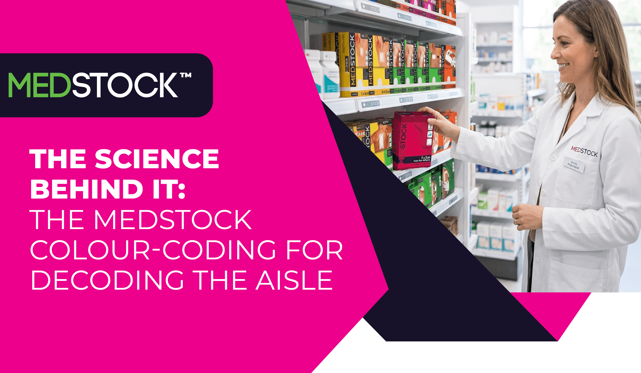
Medstock’s colour-coded packaging isn’t a marketing exercise. Each colour corresponds to a dressing category defined by its physical properties and moisture-handling capability – the two most clinically meaningful variables in dressing selection.
Consider the spectrum:
- Yellow signals fabric island dressings, first-line protection for low-exudate wounds like grazes and abrasions.
- Pink denotes the silicone range, gentle adhesion specifically for fragile or aged skin, where standard adhesives risk stripping the epidermis.
- Red indicates foam non-adhesive dressings, high-absorption products suited to the ongoing fluid management demands of ulcerated wounds.
- Grey marks the super-absorber range for wounds with very high fluid output, where conventional dressings would be quickly overwhelmed.
- Army green identifies alginates, derived from seaweed, capable of promoting clotting for wounds with active bleeding alongside high exudate.
The progression from yellow through to grey roughly tracks wound complexity and fluid burden. That’s not a coincidence, it’s a deliberate design logic that encodes clinical knowledge into a visual system.
Colour coding provides a practical starting point. Dressing choice should also consider fluid level, wound condition, surrounding skin, and individual patient needs.
Medstock started the trend
Medstock was among the first wound care suppliers to introduce colour-differentiated packaging across a complete range, drawing directly on our clinical experience.
What began as a clinical insight has since been validated by research in adjacent healthcare settings. Studies in hospital pharmacy have shown that colour-coded product zones for rapidly dispensed medications improve both efficiency and medication safety by making retrieval faster and more intuitive. The same cognitive principle applies on the pharmacy floor – when the visual system does the first layer of sorting, the brain can focus on the finer clinical judgement.
Simple nomenclature. Faster consult.
One of Medstock’s most underappreciated design decisions is its product naming.
Rather than adopting complex clinical terminology, Medstock uses plain descriptors. We don’t ask pharmacy teams to decode a phrase like “non-adherent polyurethane foam dressing with CMC hydrophilic granules.” We call it what it is: Foam Non-Adhesive.
In the same way, a “thin-profile bordered silicone adhesive foam dressing” becomes Silicone Foam Lite, a “high-capacity exudate-retentive dressing” becomes Super Absorber, and a “non-invasive adhesive skin closure device” becomes Wound Closure.
This matters enormously at the point of sale. A pharmacy assistant doesn’t need to know the full biochemistry of hydrocolloid gel formation to recommend the right dressing – they need to know that the blue box is for dry wounds and minor burns, and that it maintains moisture balance.
The name confirms it.
The colour signals it.
The consultation becomes a conversation, not a clinical exam.
The modular advantage: building the right solution
Many wound presentations require a combination of products. A non-stick pad (orange) needs a fixer roll to stay in place. A burn patient may need a hydrogel beneath a hydrocolloid. An alginate dressing needs a secondary fixation layer.
Because Medstock’s colour system categorises products by function rather than format alone, it naturally supports modular thinking. Staff learn to recognise not just which colour applies to the wound, but which colours work together – turning a potential upsell moment into a genuinely better clinical outcome for the patient.
Solving choice paralysis and reducing error
Research in behavioural science shows that more options can lead to decision paralysis and a higher rate of selection errors.
Medstock’s colour system functions as an error-reduction architecture. Narrowing the field of consideration before clinical specifics are even assessed reduces the cognitive load on staff and the probability of a mismatch. This shared visual language shortens the learning curve for new staff, locums, and pharmacy assistants.
Quick identification. Right dressing
The Medstock Advantage Colour-Coding System ultimately delivers one thing: confidence at the shelf.
When a pharmacy assistant sees the pink box, they know it’s for fragile skin. When a customer points to a weeping surgical wound, the green options come into view immediately. The colour does the first clinical sort. The pharmacist applies the final judgement.
That’s not oversimplification – it’s smart design that respects both the complexity of wound care and the reality of a busy pharmacy environment.
To explore the full Medstock wound care range, visit medstock.com.au.
Disclaimer
All information is general and not intended as a substitute for professional advice.
References
- Jairoun, A. A., Al-Hemyari, S. S., Shahwan, M., El-Dahiyat, F., & Al-Ghananeem, A. M. (2025). Improving efficiency in hospital pharmacy systems: the case for color-coded zones for rapidly dispensed medications. Journal of Pharmaceutical Policy and Practice, 18(1). https://doi.org/10.1080/20523211.2025.2493169,
- Iyengar, Sheena & Lepper, Mark. (2001). When Choice is Demotivating: Can One Desire Too Much of a Good Thing?. Journal of Personality and Social Psychology. 79. 995-1006. 10.1037/0022-3514.79.6.995, https://www.researchgate.net/publication/12189991_When_Choice_is_Demotivating_Can_One_Desire_Too_Much_of_a_Good_Thing,